 Before customers read a sign, notice a logo, or step inside, they decide how a space feels.
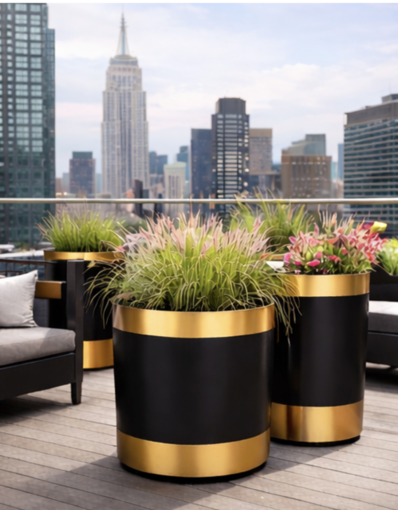
Black-and-gold planters play a decisive role in that decision. The combination signals structure, quality, and intention in seconds, shaping perception long before interaction begins. In commercial environments where attention is brief and competition is constant, these visual cues influence trust, confidence, and willingness to engage.
At Planter Resource, black-and-gold planters support intentional design and fast execution, with same-day and next-day delivery available across NYC.
Explore black-and-gold planters designed for commercial spaces.
First Impressions Form Faster than Most People Realize
People assess environments almost instantly. Research from Princeton University shows that first impressions are formed in as little as one-tenth of a second, based solely on visual information. In commercial settings, that moment determines whether someone slows down, walks in, or keeps moving.
Black-and-gold planters work within that narrow window because they convey clarity and confidence without explanation. The message is subtle but immediate: this space is considered, maintained, and intentional.
Black Grounds a Space and Establishes Authority
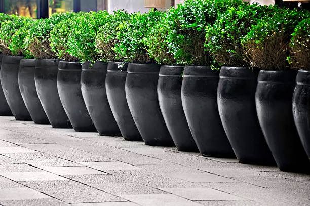
Black functions as a stabilizing force in design. It absorbs visual noise and adds weight, especially in busy commercial environments such as retail streets, hotel entrances, and office lobbies.
In planter design, black:
- Creates clean boundaries around greenery
- Anchors, entrances, and pathways
- Feels permanent rather than seasonal
- Signals control and professionalism
Unlike lighter or trend-driven colors, black rarely feels temporary. It frames the space and allows other elements, plants, architecture, and signage, to feel more intentional.
Gold Adds Value Without Demanding Attention
Gold introduces warmth and refinement, but its power lies in restraint. In black and gold planters, gold is rarely loud. It appears as a metallic finish, a subtle sheen, or a reflective surface that naturally catches light.
Psychologically, gold is associated with:
- Quality
- Achievement
- Care and craftsmanship
- Elevated experience
When paired with black, gold feels composed rather than flashy. The result is a signal of value that reassures rather than overwhelms.
Luxury Signals Without Intimidation
One of the most substantial advantages of black-and-gold planters is their balance. They communicate premium positioning without creating distance.
In commercial spaces, that balance matters. Customers want to feel welcomed, not judged. Tenants want to feel proud, not pressured. Visitors want to feel confident entering the space.
Black and gold planters achieve this by pairing strength with warmth. The space feels elevated but accessible, refined but grounded.
Contrast Creates Focus in High-Traffic Environments
Urban commercial spaces are visually crowded. Movement, signage, lighting, and architecture compete constantly for attention.
Black and gold planters create contrast that restores order:
- Dark finishes reduce visual clutter
- Metallic accents reflect natural and artificial light
- Greenery appears sharper against darker tones
- Entrances feel framed instead of lost
This clarity improves flow without additional signage or barriers. People intuitively understand where to pause, enter, or gather.
 Material Quality Reinforces the Message
 Material Quality Reinforces the Message
Color alone does not create perception. Finish quality determines whether the signal feels authentic or artificial.
In commercial settings, black and gold planters must:
- Hold color consistency
- Resist chipping or fading
- Maintain clean edges
- Perform under daily use
This is why many commercial environments pair this color palette with durable materials like fiberglass. The finish remains intact, the silhouette stays sharp, and the planter continues to support the brand image over time.
At Planter Resource, black and gold planters are explicitly selected for their ability to maintain appearance in real conditions, not just at installation.
Consistency Builds Brand Recognition Across Locations
Repeated visual cues create memory. When black-and-gold planters appear across multiple locations, storefronts, hotels, offices, or residential buildings, they reinforce brand identity without repetition.
Consistency communicates:
- Stability
- Professional management
- Long-term investment
Even when visitors cannot articulate the design choice, they recognize the experience. Familiarity builds trust, and trust increases engagement.
Seasonal Flexibility Without Redesign
Black-and-gold planters do not belong to any one season. That versatility strengthens their psychological impact.
- In winter, they frame evergreens and sculptural branches
- In spring, they elevate fresh florals
- In summer, they anchor lush greenery
- In the fall, they complement warm tones
The foundation remains constant while the planting evolves. This continuity keeps the space feeling intentional year-round.
Design that Speaks Before Interaction
The most effective commercial spaces communicate without explanation. Black-and-gold planters contribute to that silent dialogue.
They signal:
- Care before conversation
- Quality before purchase
- Intention before experience
In environments where every second matters, that silent communication carries real value.
Perception Supports Performance
Design psychology is not abstract. It influences how long people stay, how comfortable they feel, and how they perceive value.
Black and gold planters succeed because they:
- Establish structure immediately
- Signal premium positioning
- Adapt across environments and seasons
- Maintain appearance under real use
When perception aligns with performance, the space works harder without asking for attention.
At Planter Resource, we help commercial spaces use design intentionally, starting with planters that quietly shape how a space is experienced.
Get in touch to request black-and-gold planters curated for commercial use.